

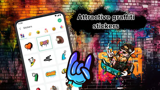
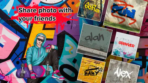
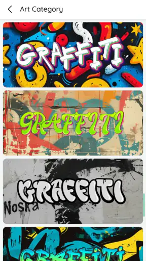
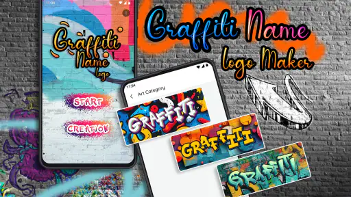
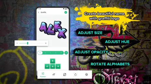
I approached Graffiti Name Logo Maker as a quick creative tool rather than a full graphic-design studio, and that distinction matters. Its main purpose is simple: turn a name or short word into a graffiti-style visual that can be used for a profile image, a casual poster, a social post, or a personal project. I found the appeal in how quickly it moves from an empty screen to something recognizable and expressive, without asking me to learn a complicated design workflow first.
This is a free photography app from GeniusTools Labs, available for everyone and designed for devices running Android 8.0 or later. It has built a strong audience, with a 4.8 average from around 31 thousand ratings and more than a million installs. Those figures suggest that the straightforward idea is connecting with many people, but popularity does not automatically make an app suitable for every job. My experience was more positive when I treated it as a name-art generator and less positive when I expected the control of professional logo software.
Starting with a name and building a usable result
The baseline workflow is deliberately uncomplicated
The natural starting point is to enter a name, nickname, initials, or another short piece of text and explore the available graffiti treatment. That makes the app especially approachable for someone who wants a visual result in a few minutes. I did not need to begin by understanding layers, paths, masks, or a large collection of technical controls. The process feels closer to trying visual ideas than constructing a logo from the ground up.
For a first attempt, I recommend using a short word rather than a long sentence. Graffiti lettering depends on shape, spacing, and visual weight, so a compact name usually remains easier to read. Longer text can become crowded, particularly when the chosen style already has dramatic outlines or decorative details. This is one of the first practical trade-offs: the app encourages expressive lettering, but expression can reduce clarity if the text is too ambitious.
I also found it useful to test the same name in several styles before making other decisions. A design that looks impressive in a thumbnail may lose its character when viewed larger, while a quieter option can become more versatile on a profile picture or small social graphic. Instead of choosing the first eye-catching result, I would create a small shortlist and compare them for readability, balance, and how well the lettering matches the person or project behind it.
The app works best when the name itself is the focus. A nickname for a gaming profile, a child’s name for a birthday image, or a creator’s handle for a social avatar are all sensible uses. It is less convincing as a complete brand identity solution because a serious identity normally needs consistent typography, precise spacing, flexible editing, and dependable reproduction across many formats. Here, the fun is in getting a distinctive name graphic quickly.
Small preparation choices make a visible difference
Before entering text, I would decide where the finished image will be used. A profile image needs strong recognition at a small size, while a story post can tolerate more visual detail. A name intended for a printed card needs enough contrast and clean edges to remain understandable away from the phone screen. Thinking about the destination first prevents a common mistake: selecting a style for its drama and only later discovering that the name is difficult to read.
Capitalization is also worth treating as a design choice rather than a typing habit. Initial capitals, all-capital lettering, and lowercase text can create noticeably different visual rhythms, depending on how the selected treatment handles the characters. I would try the spelling exactly as it should appear publicly, including accents or unusual characters when relevant, rather than designing with a temporary version and assuming the final result will feel identical.
Another useful habit is to keep the first version simple. I prefer to establish a readable base design before adding visual intensity. If the app offers decorative adjustments within the selected creation flow, I would change one element at a time and compare the result with the previous version. That makes it easier to identify which choice improved the design and which merely made it busier.
Settings and choices worth checking before saving
The most important checks are not necessarily the most dramatic ones. I look first at the text itself, then at contrast, background treatment, and the overall amount of detail. A bright name on a busy background may look lively in the editor but become hard to use elsewhere. When I want a more flexible result, I favor a clear separation between lettering and background instead of stacking several strong effects together.
It is worth checking the preview at the scale where people will actually see it. I often inspect a design both close up and as a small image. At close range, fine decoration can seem attractive; at reduced size, it may disappear or merge into the outline. This simple test is more useful than judging only from the editing view because many name graphics are ultimately displayed as small avatars or thumbnails.
I would also review the final spelling carefully before saving or sharing. A visual editor can make a typo feel less obvious because attention goes to color and style first. Names with repeated letters, unusual capitalization, or punctuation deserve an extra pause. If the app allows changes after a preview, I would correct the text before investing time in visual refinements.
Because this is a free app with in-app purchases ranging from $0.99 to $99.99 per item, I would pay attention to any purchase prompt during experimentation. The free starting point makes it easy to try, but a user should understand which creative choices are available without payment before building a design around one particular look. I would not assume that every visible option is included simply because the app itself costs nothing.
The current version is 7.0.3, so the interface may feel more developed than a minimal one-screen generator, but I still approach it with the expectations of a focused mobile tool. I do not treat it as a replacement for a desktop editor. Its strength is reducing the distance between an idea and a shareable name image, not exposing every possible design control.
Faster patterns for repeat work
Experienced use becomes quicker when I separate exploration from production. On the first pass, I try several treatments without worrying about perfect finishing. On the second pass, I return to the strongest candidates and check legibility, balance, and intended use. This avoids repeatedly polishing designs that were never suitable in the first place.
For someone creating several related graphics, consistency matters more than constant novelty. I would keep the same general visual direction for a group of names and change only the text when possible. That approach is useful for a small gaming team, a classroom activity, a family event, or a set of social highlights. The result feels more organized than choosing a completely different style for every name.
A practical shortcut is to prepare the text list before opening the app. Write down the exact names, spellings, and capitalization you need, then work through them in a fixed order. This reduces the chance of accidentally producing one version with a nickname and another with a formal name. It also makes comparison easier because the same workflow is being applied to each design.
I would save or export only after checking the image in context. For an avatar, place it mentally inside a circular crop and make sure the key letters are not too close to the edges. For a post, consider whether the chosen background will compete with a caption or surrounding images. These are not advanced editing tricks; they are repeatable habits that make a simple generator more dependable.
Another efficient pattern is to create one restrained version and one bold version of the same name. The restrained option is usually more adaptable, while the bold option may work better for a celebratory graphic or a personal statement. Comparing those two extremes helps reveal what the design actually needs instead of adding effects automatically.
Where the app reaches its limits
The biggest limitation is control. A dedicated logo editor or image-design application will generally be better when I need exact alignment, custom typography, editable layers, brand colors, or a carefully managed export workflow. Graffiti Name Logo Maker is more comfortable when the desired outcome is a stylish name treatment than when the design must follow strict identity guidelines.
It is also not the ideal choice for detailed illustration. If the project needs a custom character, a hand-drawn scene, product photography, or a multi-element poster, I would move to a broader graphics app. The name remains the central object here, and forcing the tool to handle a larger composition can make the process feel constrained.
Users who dislike decorative lettering may find the entire concept too narrow. The app is built around graffiti-inspired presentation, so it makes sense for energetic, informal, and personal visuals. It is less appropriate for a conservative business mark, a formal document, or a design where neutrality is more important than personality.
I would also be cautious about treating an automatically styled name as unique branding. A generated look can be attractive and useful, but it may resemble the visual language of other name-art creations. For a personal profile, that is usually fine. For a business that needs a distinctive identity and long-term consistency, I would use this app for brainstorming and then refine the selected idea elsewhere.
The age rating of Everyone makes the app approachable for a broad audience, including younger users working on harmless creative projects. Even so, I would encourage children to ask before making purchases, particularly because optional items can vary considerably in price. The simple interface may invite experimentation, which is good creatively but also means it is sensible for families to understand how paid choices are presented.
Everyday scenarios where it makes sense
Imagine a teenager preparing a new gaming profile. They want their nickname to look more personal than plain text, but they do not want to spend an evening learning a professional editor. This app is a reasonable fit: they can try several graffiti treatments, select one that remains readable at avatar size, and use the result as a quick identity image.
Another realistic example is a parent making a birthday collage. A child’s name in a bold, colorful style can act as a visual title without requiring a separate lettering project. In that situation, speed and personality matter more than perfect brand consistency, which plays directly to the app’s strengths.
A small creator could also use it to test a handle before commissioning a polished logo. I see value in producing several rough directions, noticing which letter shapes and visual moods feel right, and then taking that insight into a more flexible design tool. The app becomes a sketchbook for identity ideas rather than the final production environment.
For a group activity, each participant could receive a name graphic with a related style. The important workflow detail is to agree on a visual direction first. Without that decision, a collection of individually attractive designs may look unrelated when placed together. Consistency is created by the user’s process, not necessarily by the generator itself.
How it compares with the usual alternatives
Compared with typing a name in a standard photo editor, this app offers a faster route to a graffiti-oriented result. A general editor may provide more flexibility, but it can also require searching for fonts, adjusting outlines, arranging layers, and finding a suitable background. If the only goal is expressive name lettering, that extra work may not be worthwhile.
Compared with a professional logo application, the balance changes. Professional tools are stronger for exact control, reusable brand systems, transparent workflows, and revisions. They are the better choice when a design must be delivered in several formats or edited repeatedly by different people. I would choose this app when speed and experimentation matter more than technical ownership of every detail.
Compared with ordinary text-on-photo apps, the graffiti focus gives the result more personality without requiring me to build the visual style from scratch. The trade-off is that the range of appropriate projects is narrower. A general photo editor can adapt to many subjects, while this tool is most convincing when the name itself should feel like the artwork.
Who should use it and who should skip it
I recommend it to people who want a quick nickname graphic, a playful profile image, a personalized social post, or a starting point for a graffiti-inspired visual idea. It is particularly friendly to beginners who would rather explore ready-made creative directions than assemble every element manually.
I would steer professional designers, small businesses needing a complete identity system, and users who require precise typography toward a more advanced editor. The same applies to anyone creating complex compositions rather than name-centered artwork. The app can contribute an idea, but it should not be mistaken for a complete replacement for a full design workflow.
My strongest advice is to judge the result at its intended size, keep the wording short, and compare a restrained option with a more dramatic one. Those three habits prevent most disappointments and help the app’s central idea work better.
My final view after using it
Graffiti Name Logo Maker succeeds because it keeps its creative promise focused. I can turn a name into something more memorable than plain lettering without committing to a complicated editing session. The free entry point, Everyone rating, broad device compatibility, and substantial user adoption make it easy to try, while the 4.8 average indicates that many users find the experience satisfying.
My recommendation comes with a clear boundary: use it for fast, expressive name art, not for demanding identity design. I like it most as a practical idea generator and a quick finishing tool for personal graphics. When I need exact control, repeatable brand standards, or a complex composition, I would switch to a broader editor. For the right small project, though, this app turns a plain name into a visual statement with very little friction.


